Sunday, December 29, 2013

December Tim Tag


Merry Christmas & Happy New Year!  I hope everyone is enjoying their holidays and had a wonderful year!

I slacked off for the last few months on my Tim tags since I started working, but with Kelly home, and a holiday break, I'm back in the swing of things!  We got to work on the December tag, and we had a blast creating!  It felt good again! 

We made these last week, but I've been dragging my feet to actually write this post.  Something funky has been going on with the pictures here on my blog, and I can't seem to get any help from Blogger or Google.  My older pics are replaced with a gray circle with a dash in it.  What's up with that?  I thought it was just on my computer, so I've been putting up with it, but I ran into a blog follower, and she asked me what's up.  Please, if anyone can help, let me know.

If you'd like to see Tim's original blog post, you can view it here.  I love making his tags, and I hope he never stops.  He's just a wealth of talent and creativity, and he can make anyone feel like they can do anything!

So, back to the tag.  I was achin' to make one of these flowers ever since I first saw it on Wendy Vecchi's blog (click here to view).  I was in Europe at the time visiting my nephew and his family, and so far away from my craft room.

Kelly created with me, and our flowers came out fabulous!


I went a little crazy with the splattering, but what fun we had!  Can't wait to see what Tim brings us in the new year!  Be safe everyone!  xoxo


Wednesday, October 16, 2013

It's Play Time!


Last week was the debut of Tim Holtz's Creative Chemistry 102, and if you know me, I signed up for his classes.  I was also working last week, plus we went up to Rochester to see the kids, so I never got a chance to work on any of the techniques until today.  I've got to say, if you haven't taken Tim's Creative Chemistry classes, you're really missing out.  He not only teaches you loads of techniques, he explains the properties of all the inks, paints, stains, etc. that Ranger makes.  You'll end up with a better understanding of the differences between all the products, and you'll be beaming with confidence to attempt any technique!

Creative Chemistry 101 is a prerequisite for taking CC102, and you can take the classes any time.  CC102 was even better than CC101, because there are 30 techniques, plus samples of each technique by talented designer friends of Tims.

The six techniques from the first lesson were all using Tim's Distress Paints.  I worked on 3 of the 6 today.  Oh, and I want to mention that I want these tags to show ONLY the techniques I was learning, so if it was a background technique, that's all that's on the tag; if it was a technique on an element, then I just did a simple inking & blending of Distress Inks on the tag to hold that element.

OK, so let's see some pics!


This technique is called Altered Surface, and the surface is one of Tim's plastic numbers.  After layering (and drying) each color, I decided to add some clear embossing to spruce it up.  I guess with all the drying between layers, I didn't even think about it ... plastic melts!  lol  So, after re-shaping my deformed number two, I adhered it to a tag.  Now, it looked even worse, because there were lots of finger smudges in my embossing (and a couple slightly burned fingers!  haha).


No problem!  Glossy Accents to the rescue, and I think it came out great (considering).


Next was Colored Crackle.  Rock Candy Distress Crackle Paint with lots of colors of Tim's paints.


On Tim's samples, the Distress Stain showed more crackle than the Distress Ink, because the stain is a fluid ink.  Funny, but on my samples, I think I got more crackle detail when I used the Distress Ink (left leaf).


Finally, Eroded Metallic.  Wowza!  Tim's sample looked like real aged brass, but he also warned us that this technique doesn't always work.  I got this result on my second try.  Not too bad.


I definitely want to play with this technique a lot more.  I just love the look!


In case you're wondering, this was my first attempt.  I got a feeling my third time will be the charm!

Off to work on more techniques!
xoxo

Wednesday, September 11, 2013

Back in the Swing of Things

Since my foot surgery back in May, I haven't had any classes.  In the last month or so, I've wanted to, but something always makes me change my mind ... no time to make samples, classroom table is a mess, uninspired, etc.

Well, last week, I ended up scoping things out on Pinterest, and something just 'clicked'.  I don't know, but I got so inspired!  I got right to work and made a card.  I felt rejuvenated!  Then, on Saturday, I was invited to attend Fall Fest with my ex-upline group from Stampin' Up!, and the samples, talented women, and projects we made were fabulous!  I spent the rest of the weekend making cards, and sent out the email ... "new class scheduled for ..."

So, class was last night, and it felt great!  I want to keep this feeling going, so I just sent the email announcing my Stamp-a-Stack class scheduled for next Monday!  Yeah!

Anyway, here's what we did last night:


This first card was designed by Brenda Keenan, and I found it on Pinterest.  I believe she even had a video tutorial.  This was the card that first inspired me last week ... isn't it great?!  It's a faux layering technique using By the Tide & Bring On the Cake stamp sets.  The colors used were Marina Mist, Midnight Muse & Island Indigo on Whisper White cardstock.  One of those rare cards that would be perfect for a man.


This next card I saw at Fall Fest on Saturday.  I'm so sorry, but I never got the original artist's name.   The texture on this card is amazing!   I wish it showed up better in the photo.  You'll never guess how it's done.  OK, I'll tell you ... it's a used dryer sheet.  Just stamp onto the Whisper White cardstock with Crumb Cake & Soft Suede inks (Lovely as a Tree stamp set).  Then, cut the dryer sheet to size, spray with some spray adhesive, sprinkle on some Dazzling Diamonds, and flip it over onto the card.  Absolutely gorgeous!  The dryer sheet with the glitter makes it look like a beautiful snowy scene.


This final card was one I designed.  I learned this technique by taking Tim Holtz's Creative Chemistry 101 online classes last year.  The technique is call Reflections Stamping.  It's called that because since you stamp directly onto the embossing folder, your image will come out reversed..So, if you wanted text, you'd have to use a special reversed text stamp.  Any other image works great though.  I thought it'd be a cool idea to use a woodgrain background.  I used Ranger Distress Inks for this, and the colors are Bundled Sage, Weathered Wood and Wild Honey for the background.  The trees have Forest Moss and Walnut Stain.  I then swiped Walnut Stain around the whole card.  The woodgrain image was stamped in Coffee Archival ink, and the saying in Black Archival ink.  During class though, we decided to use black detail embossing power on the saying to make it pop more.  We used scrap file folders for the images layered on Basic Black and Old Olive SU papers.

Friday, August 30, 2013

August Tag ... finally!


Poor Grace was working so much this month, she never had time to come play and make this month's tag.  And, Kelly went back up to school last weekend, so I had to play on my own.

Tim made some very simple tags this month using his Masks.  So simple, in fact, he made four!  His were all travel themed, and you can see them here with all his instructions and step out photos.  I decided to use the Urban Tapestry set for mine.

The base colors are the same as Tim's:  Pumice Stone & Frayed Burlap Stains.


I stamped the bird & branch using Archival Coffee ink.  I also made a mask using Black Staz-On ink and carefully cut it out.  I laid the mask on top of the bird, and meticulously colored the floral stamp using Rusty Hinge, Stormy Sky, Vintage Photo & Forest Moss Markers.  After all that coloring, I "huffed" repeatedly on the stamp to re-moisten the ink, then stamped the bottom corner overlapping the mask.


After stamping a little more using Forest Moss to stamp the corner frame, and Stormy Sky to stamp the splatters, I added a rub-on from Tim's Numbers Remnant Rubs.  I added some spinner hands and a long fastener to the clock image.


I added some Stormy Sky Distress Ink around the edges with my ink blending tool, then added a little Frayed Burlap Distress Ink over that.


To finish it off, I misted the Crinkle Ribbon with some water and then swiped it in the leftover Pumice Stone & Frayed Burlap Stain that was left on my craft sheet.  I crumbled it in a ball, and when dry I added some Stormy Sky Distress Ink on the high spots by lightly swiping the pad directly over the ribbon.

Monday, July 29, 2013

July 2013 Tim Inspired Tag


Chalk up another tag for me & Grace!  My tag came out totally different from Tim's, which you can view here.  I decided to go big and bold with my die cut, so I used his Vintage Camera Sizzix Bigz die, where he went for the whole Fourth of July, patriotic thing using the American flag & stars.


I used one of his cash keys as an embellishment, and colored the crinkle ribbon with some Peeled Paint and a touch of Walnut Distress Inks.


I'll have to remember to take some photos of the process next time we make tags again.  This background technique was so much fun to do, and it looked awesome!


In honor of my old Nikon Action Touch camera I used to have years ago, I named this one "Micon" using Tim's little letters.


After coloring the grungeboard and adding the Crackle Paint, the pieces didn't quite fit into each other, so I just added some Black Soot Paint Dabber around the edges for a fun & funky look, and added some foam pop dots.

Sunday, June 30, 2013

My First Tutorial!


Welcome to my very first stamp tutorial!  I took over 50 pictures during the 2-day process of making this rubber stamp binder, but I narrowed it down to only 29.  lol  Enjoy!


Since Wendy's Studio 490 stamp sets are so large, I found some 20 x 30 sheets of chipboard at Dick's online, and cut one down to two pieces 12-3/4" x 6".  I wanted my colors to show true, so I covered both front & back covers with 2 coats of gesso.


Once completely dry, I used some low tack tape to mark off sections.


I lightly inked on four colors (Tumbled Glass, Salty Ocean, Broken China, & Chipped Sapphire), starting with the lightest color.


After adding all four colors, I misted with water (the more you mist, the more the colors will blend & run).


I wanted them to run alot, so I added lots of water.  So much, that I went back and added more colors, re-misted, and dried.


Oops!  Added so much color, that not only did the water misting splatter the ink onto my white area, it also bled through under my tissue tape border.  I added two more coats of gesso and left it all to dry overnight.  I had so much ink on them this morning, that I still had to dry them with my heat gun!  lol


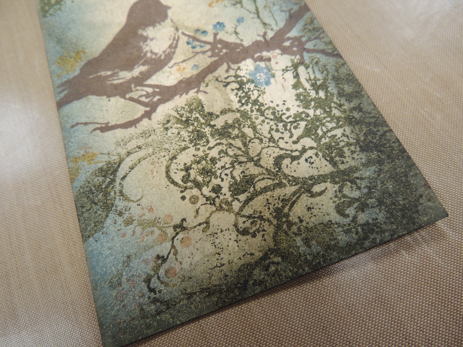
Now to decorating them ... I used some great (apropos) stamps from the Rubber Stamp Art set.  *while creating the link for that set on Simon Says Stamp's website, I put the title in the search bar, and 37 pages of products came up!  haha  Note to self ... search with set numbers from now on.*

I added some dots using Coffee Archival ink and Seriously Art.  I had a tough time finding a link for this set--finally found it on the Stamper's Anonymous site, and it's set #LCS034.


I used Wendy's white embossing past and the Wildflowers & A Bird stencil.  After drying with my heat gun, I flipped the stencil over and made another flower.  *IMPORTANT--when using embossing pastes with your stencils, remember to clean them with warm water & mild soap immediately after use*


I added some black embossing paste with the Everyday Words stencil.


When all the pastes were completely dry, I colored the flowers with Distress markers:  Crushed Olive, Milled Lavender & Dusty Concord.


I thought I needed more in the background, so I added some script text from the Live and Make Art (LCS038) set with Olive Archival ink.


I added some black dots by placing the stencil back over the flower and covering up the openings in the stencil that I didn't want inked.


Now for some fun!  I've been wanting to try this technique of coloring the embossing paste that Wendy had on her blog here.


Since it's for the covers of a book that'll get knocked around a bit, I used Archival ink instead of Distress cause I thought it might be tougher.


Mix it up well ...


tape down the stencil when covering a large area ...


and schmeer away!


Love it!


I added some Scattered Straw and Vintage Photo around the edges and lightly swiped on the surface.


For the insides of the covers, I used much more color on the top sections because I didn't want any stamping, and instead of embossing paste, I just used Crushed Olive Distress ink.


The holes for Wendy's pages are very large, so I punched several times with my Crop-a-dile.


Then I used a thin file to clean up the holes better.


The flowers looked a little lost, so I outlined them heavily with my black journaling pen, and doodled around the edges.


I also used a white Gelly Roll pen over the words and image from this stamp to make them stand out more.


I decided to use some 3" binder rings I found at Office Depot.  They'e huge, but now I can hold 11 pages in each binder instead of only 7 with the 2" rings.  I also put some Wonder Tape between the sections and added a Night of Navy (Stampin' Up!) grosgrain ribbon and knotted.

OK, so it only took me about 45 minutes to write/edit this tutorial, so I think I might do more.  I hope you enjoyed it and try some of these techniques.