Creative Chemistry 101 is a prerequisite for taking CC102, and you can take the classes any time. CC102 was even better than CC101, because there are 30 techniques, plus samples of each technique by talented designer friends of Tims.
The six techniques from the first lesson were all using Tim's Distress Paints. I worked on 3 of the 6 today. Oh, and I want to mention that I want these tags to show ONLY the techniques I was learning, so if it was a background technique, that's all that's on the tag; if it was a technique on an element, then I just did a simple inking & blending of Distress Inks on the tag to hold that element.
OK, so let's see some pics!
This technique is called Altered Surface, and the surface is one of Tim's plastic numbers. After layering (and drying) each color, I decided to add some clear embossing to spruce it up. I guess with all the drying between layers, I didn't even think about it ... plastic melts! lol So, after re-shaping my deformed number two, I adhered it to a tag. Now, it looked even worse, because there were lots of finger smudges in my embossing (and a couple slightly burned fingers! haha).
No problem! Glossy Accents to the rescue, and I think it came out great (considering).
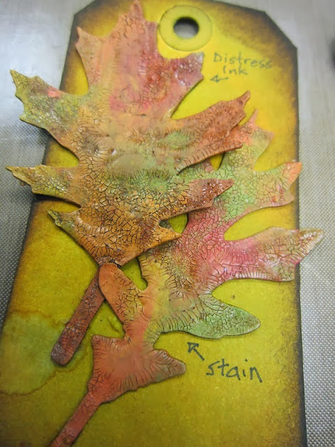
Next was Colored Crackle. Rock Candy Distress Crackle Paint with lots of colors of Tim's paints.
On Tim's samples, the Distress Stain showed more crackle than the Distress Ink, because the stain is a fluid ink. Funny, but on my samples, I think I got more crackle detail when I used the Distress Ink (left leaf).
Finally, Eroded Metallic. Wowza! Tim's sample looked like real aged brass, but he also warned us that this technique doesn't always work. I got this result on my second try. Not too bad.
I definitely want to play with this technique a lot more. I just love the look!
In case you're wondering, this was my first attempt. I got a feeling my third time will be the charm!
Off to work on more techniques!
xoxo


